Introduction
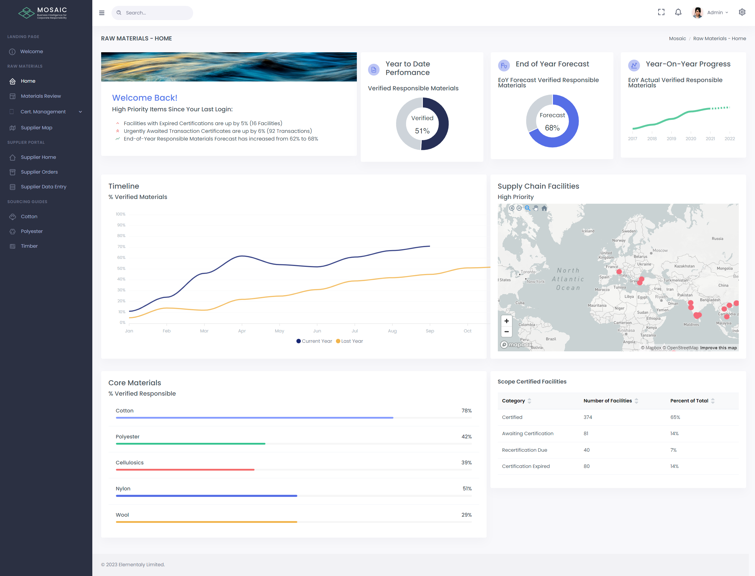
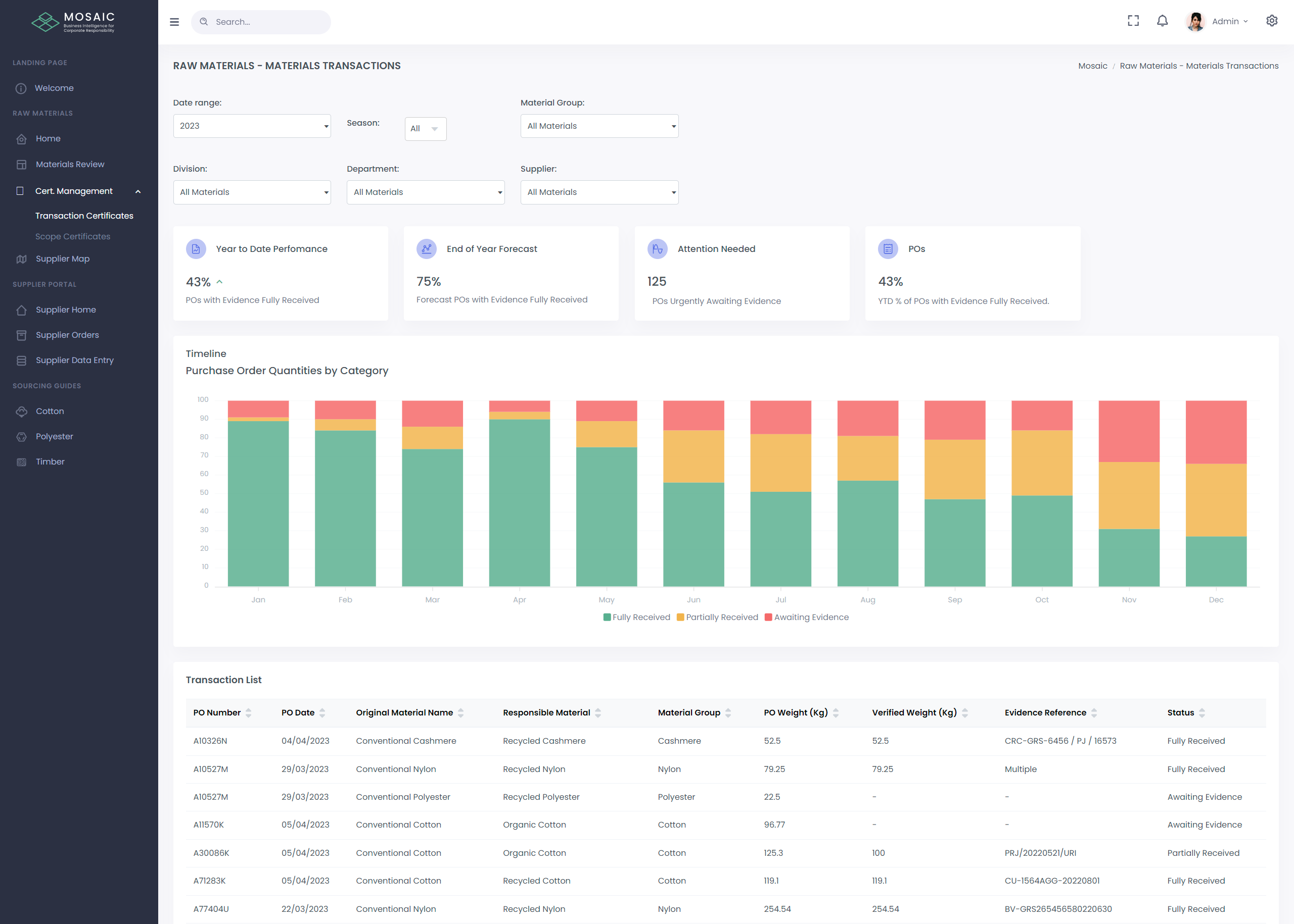
The Business Intelligence Dashboard for Corporate Responsibility. Mosaic is a fully bespoke application designed to provide crucial business intelligence & data gathering tools to corporate responsibility teams and their stakeholders.
My Task
My task was to redesign the app's overall visual look and feel. To do this, we first gathered all relevant system data, then used Chart.js for metrics and amCharts for maps.
Problem
The old design lacked a clear visual hierarchy, making it difficult for users to navigate or quickly scan the relevant information displayed in the app. Key details were often buried or overshadowed, leading to a frustrating user experience and inefficiency in finding what they needed.
Solutions
To create a consistent and visually appealing UI, we used Tailwind CSS and divided the design revamp into two phases:
Phase 1
Gather all the data in the system and organize it to enhance visual hierarchy, making it easier to scan with minimal UI updates.
Phase 2
After organizing the data, we enhanced the app's overall visual look and feel.